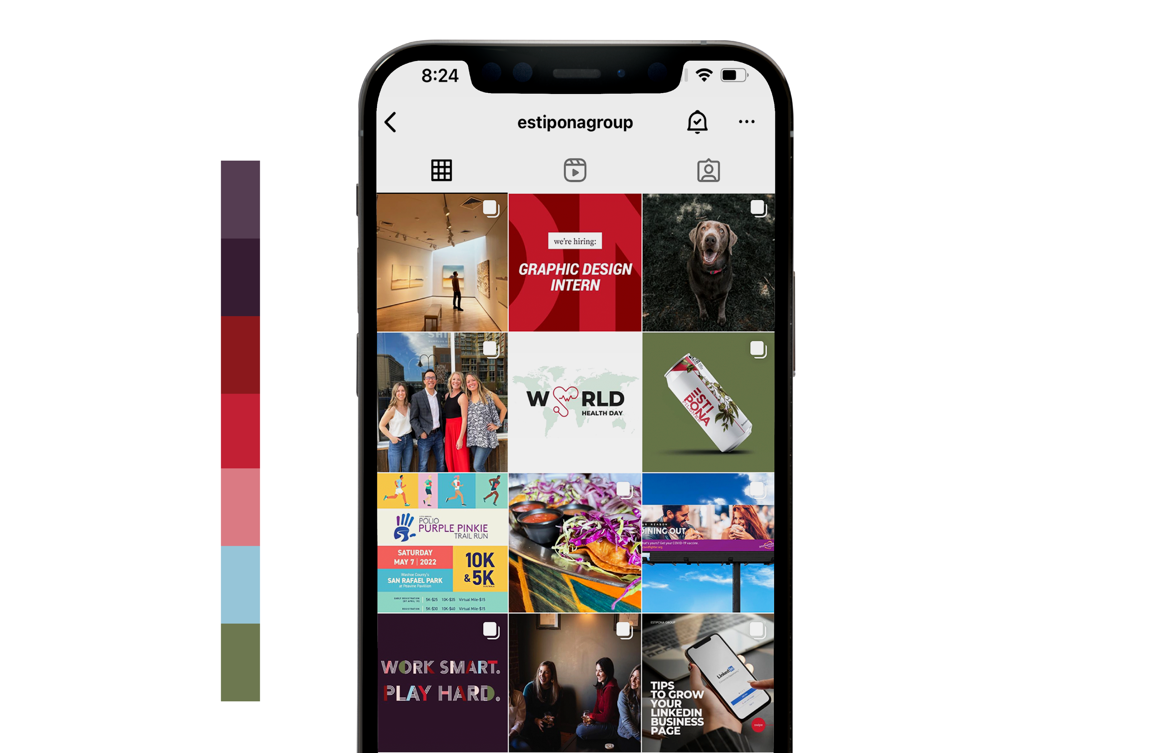
Develop a Social Media Brand Aesthetic
Have you ever stumbled on an Instagram account and thought to yourself, “Oooh, pretty!”, or “Man, they’ve really nailed the aesthetic-yet-informative-and-entertaining vibe.” If you’re looking to up your social feed game to one your competitors will envy and your customers will delight in, you’re in the right place.
Done right, a social media account is a powerful marketing tool for a business. It can help make a brand more memorable and top-of-mind for potential customers. It can create good will, generate buzz and motivate action (ya know, like making a purchase).
Let’s start by defining ‘social media aesthetic’: It’s content that is visually appealing and helps define your brand throughout your feed and between different social channels. It informs how your target audience perceives your brand. Keeping your social media accounts visually appealing helps establish a mood and style for your brand. It communicates your business’s personality, while showing off creativity and establishing brand credibility.
To develop your brand’s social media aesthetic, consistency is key. Start by adhering to your brand guidelines. (Don't have those? We can help.) Use the same fonts, colors, and imagery style to maintain consistency across all marketing platforms.

Color Branding
Is a useful way to boost brand recognition while creating visual appeal. You want someone to be able to look at your feed and quickly sense the personality of your brand and by choosing certain colors to represent your brand, you’re able to convey meaning and set a tone.

Consistent Fonts
Help reinforce your brand identity and aesthetic. The fonts you choose should reflect your business tone and should be consistently used throughout all your channels. While you might wake up in a zany mood and think Comic Sans text is the perfect way to express yourself in an IG reel, if it’s not in your brand guide, don’t use it. (Also, NEVER ever use Comic Sans).

Styled Images
Are a great addition to a well-curated social media feed. When all photos are shot or styled in a similar way, you create an identifiable look and feel, much like color branding. The content of the images will vary from business to business — a restaurant might focus on daily specials while an architect may showcase projects — but the effect can be similar for any business. Creating a consistent style that includes your business logo or colors from your brand palette will help you build that strong aesthetic.
For social media to be aesthetic and engaging to the viewer, you need to take a bird’s eye view — or rather a grid view. While there should be a variety of content types there should be recurring themes with your brand colors, graphics and images evenly distributed throughout.
Ready to dial up your social? We’ve created a list of things to keep in mind when building out your channels.
• Use a consistent color palette or set of filters
• Take the grid into account when adding new posts
• Have graphics that are visually appealing, fun and brand related
• Choose high-quality images that are well-composed and visually interesting
• Engage with your audience (Am I helping my audience solve a problem?)
• Keep an eye on trends
• Take social insights into consideration (both yours and your competitors)
• Have consistent content pillars (diverse content)
While social media is a potent marketing tool, we know it’s not everyone’s jam. If you’d like some help from folks who genuinely dig creating aesthetically pleasing, hard-working social feeds, give us a ring.


