A brand is a deeply personal thing. In many ways, it’s like a signature — a physical representation of who, what and sometimes even WHY a business is.
I recently spent some time in our business storage shed. As a virtual agency that began as a traditional, bricks-and-mortar office, we now have many items that used to live on top of desks or on walls of the office that are packed up in a storage shed that gets a good cleaning once every few years. I found my original computer system, a Macintosh LCIII — which by all standards is now a legitimate dinosaur. I found floppy disks and film negatives. I found plaques and trophies.
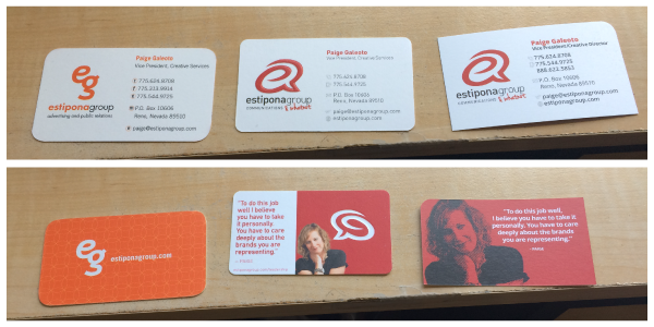
And, perhaps most importantly, I found old business cards and collateral.
This began as spring cleaning, but it ended as a virtual walk down memory lane. Seeing the various iterations of our logos, it reminded me of how important that aspect of a business is to the agency’s identity. Every logo, every different card, reflected something important during the time in which it was used.
While the names have changed, the colors have evolved and the fonts are widely different, it’s interesting to note the consistency.
We have always taken great pride in our brand.

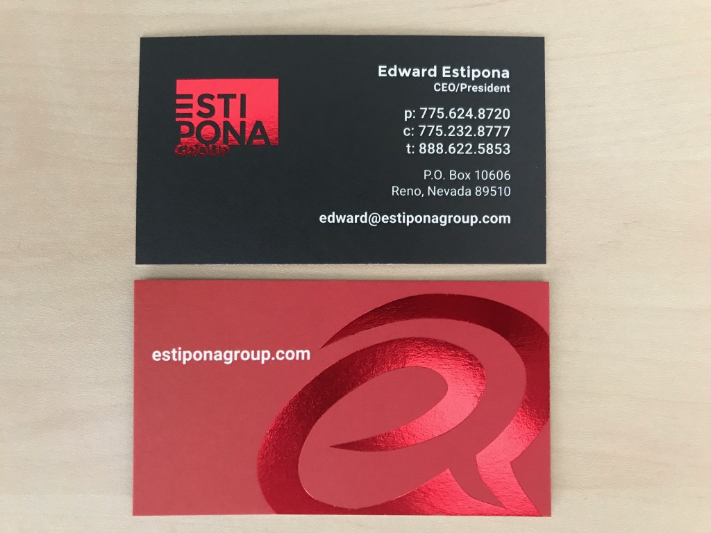
Recently, we tweaked our logo yet again. Something fresh — yes. And an opportunity to help the general population, finally, maybe, get the pronunciation of our name right. The new version actually breaks the name in a place that is quite intentional, so you cannot read “Estipona” now and somehow see “Espinoza.” Yet, somehow, we’re sure some will.
And that’s ok, too.
At the end of the day, the brand is more than the logo. Yet the brand is reflected in that signature. We’ve enjoyed the chance to trace our company’s 24-year history, reviewing different approaches to hue and execution. Just like crushed velvet and avocado green were once the centerpiece of every ‘70s home, so some of our former design choices reflect a different era of design.

We can’t wait to trace the next 24 years. And in a very special corner of the storage shed, in a box near my old Mac LCIII (which will forever be retained for posterity), we’re now intentionally keeping examples of business cards and collateral as our brand continues to evolve.
It’s like a virtual branding time capsule — one collecting the design trends that traverse our agency’s decades of being.
If you have a card or piece of collateral representing a bygone era of your business, feel free to upload a pic in the comments below or on our Facebook page. It’s always fun to see physical representations of evolution.

Some dinosaurs, like these logos, stand the test of time. Others, like my ancient computer, are far better off left on ice in storage.


