New Website for the WIN!
We’ve been powerhouse networking over croissants, breakfast meat and fruit during WIN breakfasts for many years, so when our agency was asked in 2019 to become their marketing agency of record, it was an easy “yes.” There is, after all, so much to share about this 52-year-old organization — even beyond the bacon. (We do so miss the bacon, though.)
As we dove into this creative new project, it became immediately obvious that their website does most of the heavy lifting in telling the WIN story. While this is true for many clients, WIN hosts multiple events each month and doesn’t have a physical location to help showcase its brand. Little did we know as we were finalizing the new site earlier this year, that everything the organization did soon would be virtual.
Gathering the intel
We started collecting data and planning for WIN’s marketing needs by surveying the board and other WIN members. Perhaps most critically, we also interviewed non-members through one-on-one conversations, social media and a focus group. With a goal of being more welcoming to diverse audiences, we talked to people of different ages, ethnicities, genders and business backgrounds. One of the big takeaways of these conversations was that many people, including some members, didn’t understand the full scope of all that WIN has been providing our robust business community for the last five decades. So we knew we needed to rectify that situation, stat.
Bringing it all together
Part of the challenge with the old site was that it was, well, old, and new sections were added on as they arose. This served to make the website a bit Frankensteiny (that’s the totally non-technical term for a website that had been smooshed together with sometimes unrelated parts).
Though some of us are big fans of both Mary Shelley books and Gene Wilder parodies, we knew this Frankensteined approach wasn’t a good look for a website. Additionally, the site was also not responsive, which is a problem when a significant number of WIN visitors were looking at the site on their phones or tablets. And finally, we wanted to fine-tune the overall brand and ensure the website reflected this refined direction.
Here are some of the specifics about how we approached the web portion of this project:
- We started with a site map, breaking the organization down to three main categories: Join, Events and Sponsorship Information. Based on our research and board input, we also made the membership benefits and options easier to understand while simplifying event registration.
- We created a new design, something that would better appeal to the diverse audiences WIN is working hard to welcome. And we added a place for event photos and videos, making sure to include images of the diverse people who already attend WIN events. Knowing how time-pressed WIN’s audience is, we cut the copy way down, making it more
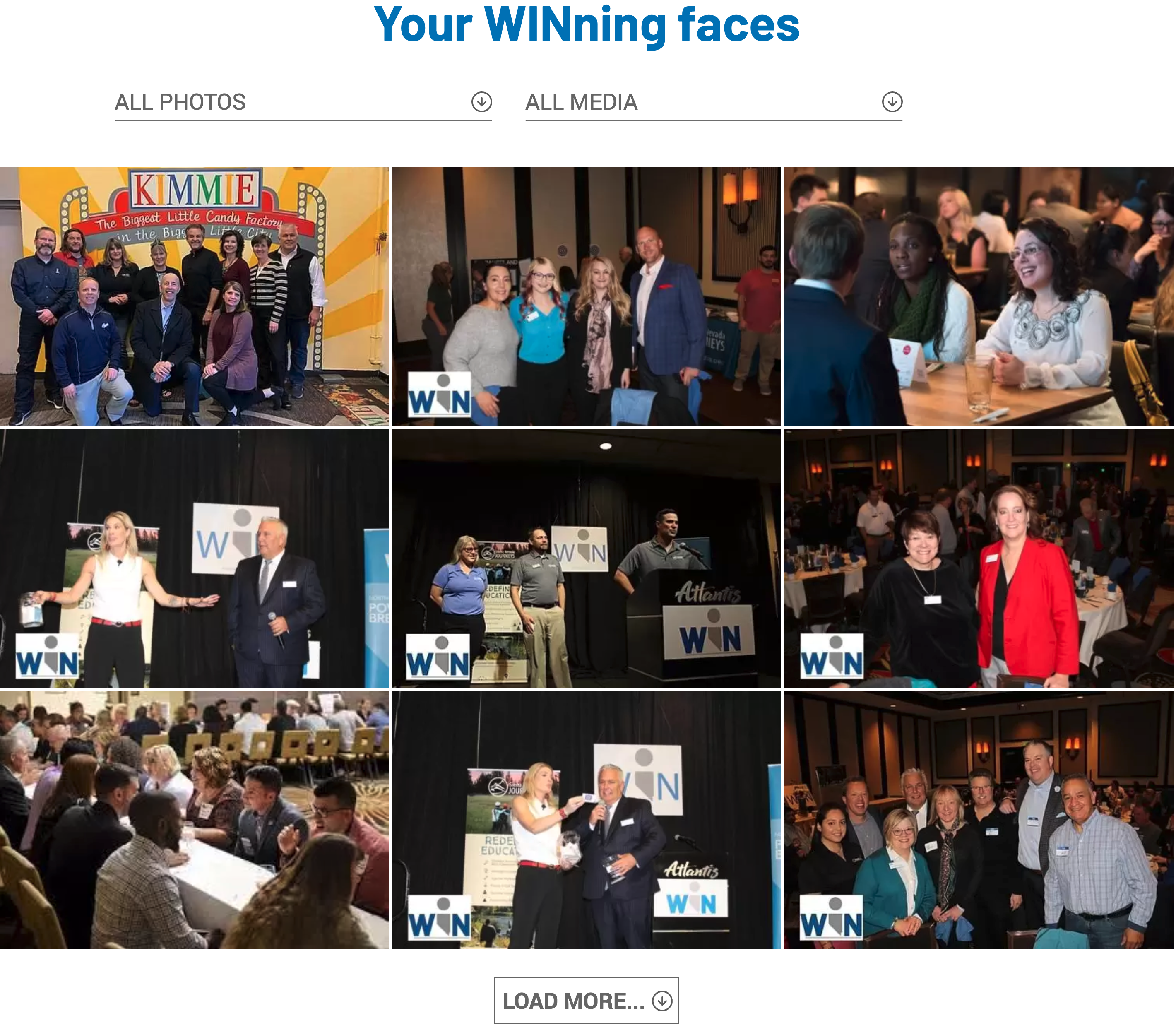 conversational in the process.
 - Our programmers added new functionality, making it easier for board members and staff to make changes from the back end. However, the template we created made it much more difficult for that open access to lead to the creation of another monster, since we’re not as much of a fan of Bride of Frankenstein.
- Perhaps most importantly, we brought the website and the CRM (customer relationship management) together onto one platform, saving staff members from having to update information in two different places. This is also where members update their business information, renew their memberships, take advantage of member discounts and sign up for events. Members can now showcase themselves and their businesses in a format much more pleasing to the eye.
In addition to a new website, we also recommended that the 52-year-old business networking organization change its primary URL to www.WIN-Nevada.com. The original URL, winevada.com, sounded to some of us like a portmanteau of “our favorite after-work drink” + “Nevada.” Though if we’re being honest, that may have just been wishful thinking.
We worked side-by-side with WIN’s Board and Executive Director Phil MacDougall every step of the way — with resounding results.
“This is what our members have been asking for,” MacDougall shared. “The new website is light years ahead of where we were. And the response from our members has been extremely positive.”
Now that WIN is all virtual for the foreseeable future, it has seen a lot more traffic from people looking for information on the additional events they’ve added to address our business community’s “new normal.”
So there you have it: Accessibility + less Frankenstein + more pictures + optimized navigation - wine in the URL = WIN’s fabulous new website! Please join us in a virtual bacon toast to WIN and our wish for a return to the in-person breakfast speaker series when it’s safe to do so. And if you’d like to debate the epic comedic genius of Mel Brooks or need help marketing your business, drop us a line. We’d love to help!
