Access to Healthcare


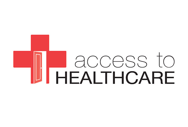
When we began working with this client, they had a logo that was dated looking and clumsy to incorporate into marketing materials. The new logo makes a fast connection to healthcare and a visual connection to their mission which is connecting people with low-cost healthcare services.
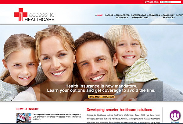
A poorly designed site not only posed problems for clients of this healthcare organization, it posed big problems for the organization which could not update content as they needed. A new site was built offering users a very intuitive navigation, easy to find resources, dynamic news content, and an online payment portal. Responsive design ensures that mobile and tablet users see a site built for their devices.
The site also provided Access employees with an easy-to-use mechanism for updating the site and adding new content.


