Neighborhood Mediation Center
The challenge
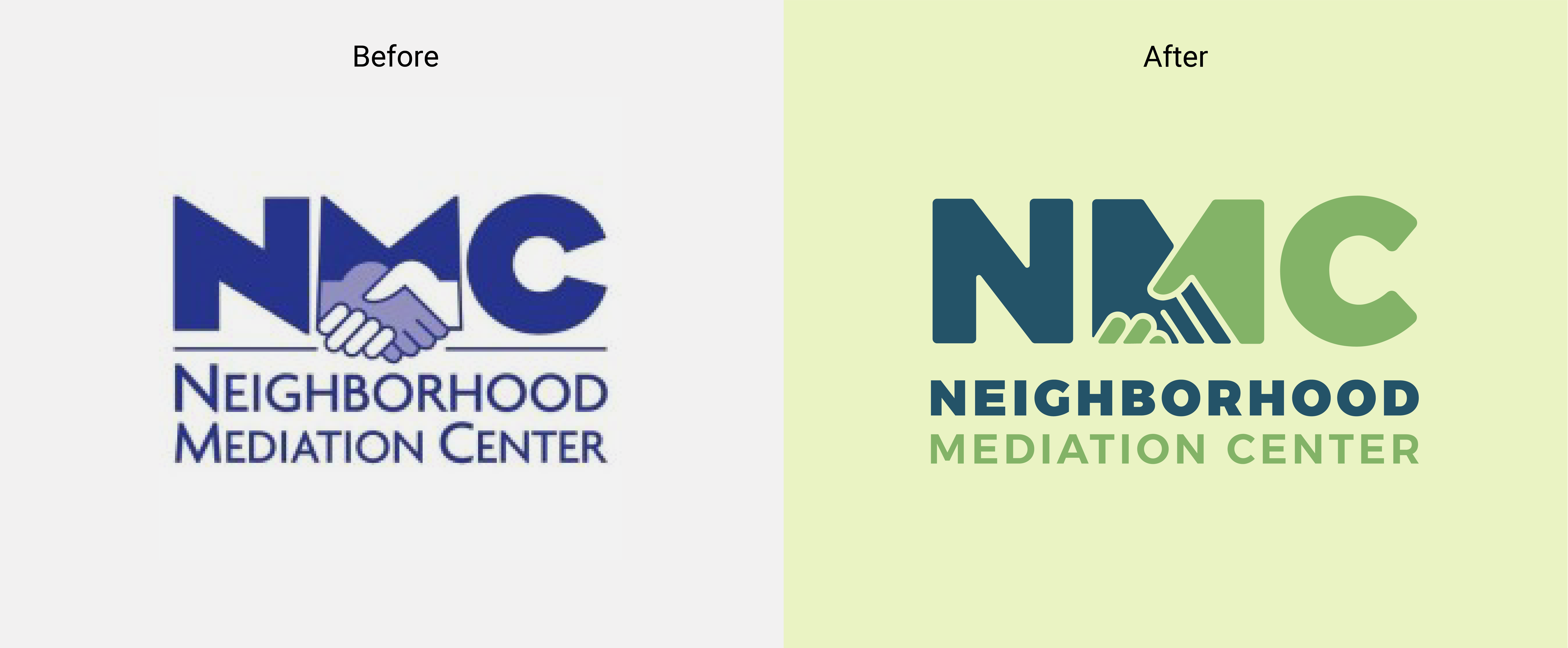
The Neighborhood Mediation Center does an amazing service in our community — they helped people resolve conflicts civilly. They've been doing this important work in Reno since 1999, but typically quietly and behind the scenes. As they look to grow and expand services in conflict resolution and mediation coaching and training, they were looking to update their brand which was feeling dated.
Our brand refresh process began with a client discovery and creative brief. We then explored many different approaches to help communicate their mission of seeking civility and resolution for all conflicts in the community. This iterative process helped us achieve multiple objectives — to address the client's fondness for the original logo and create a more contemporary mark.
BEHIND THE PROCESS
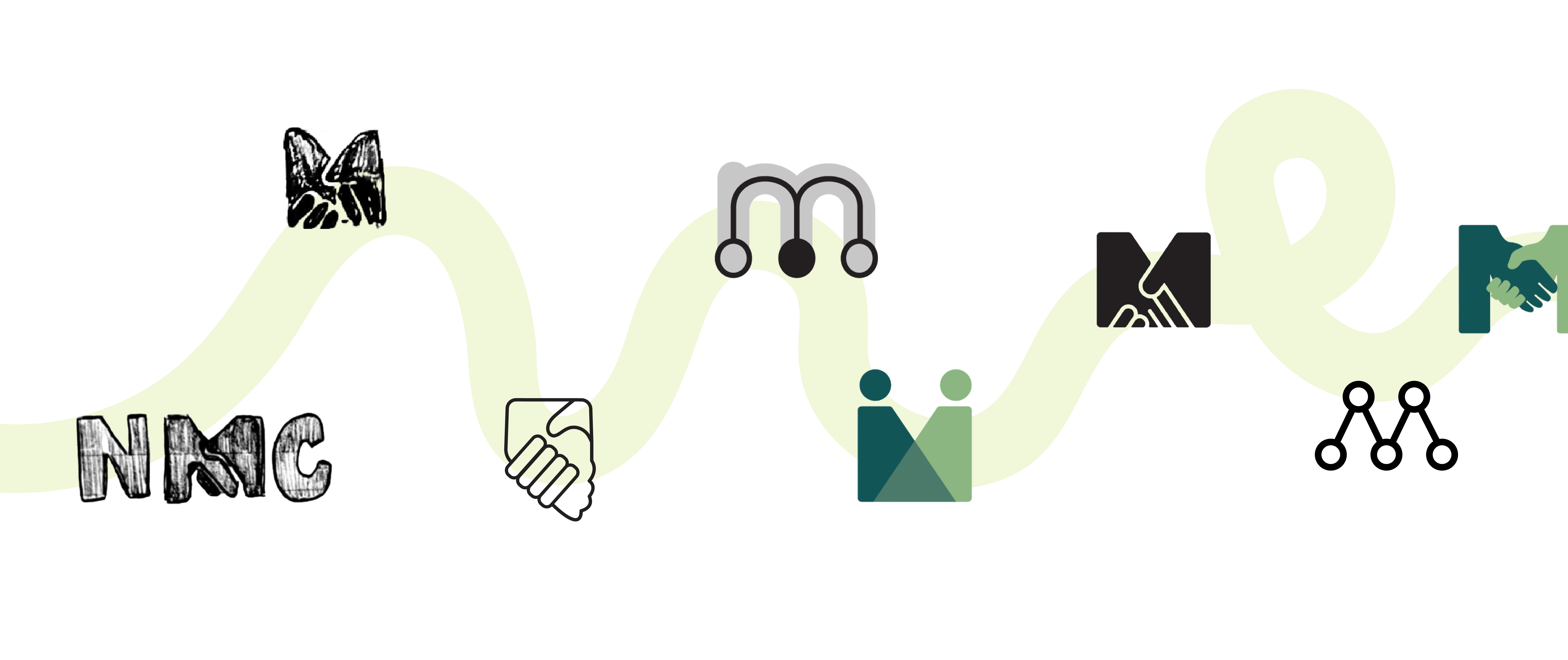
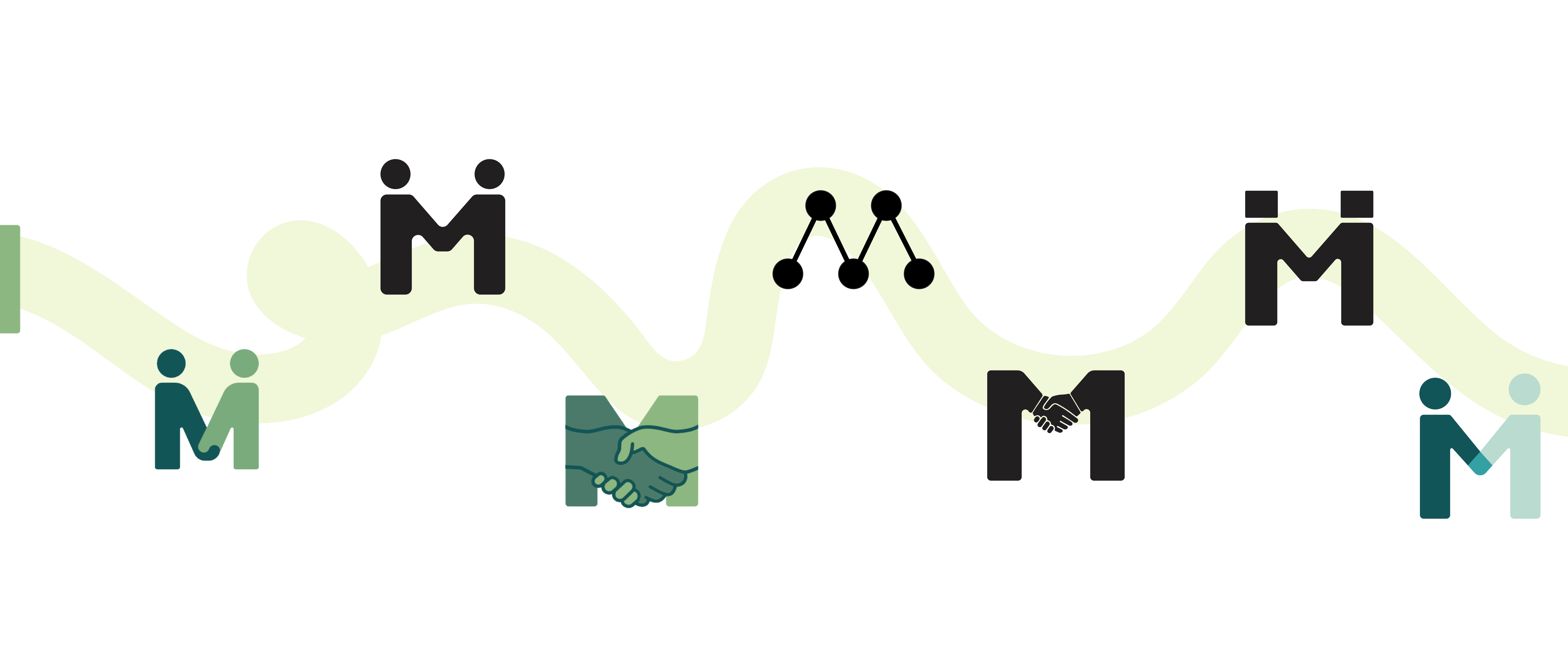
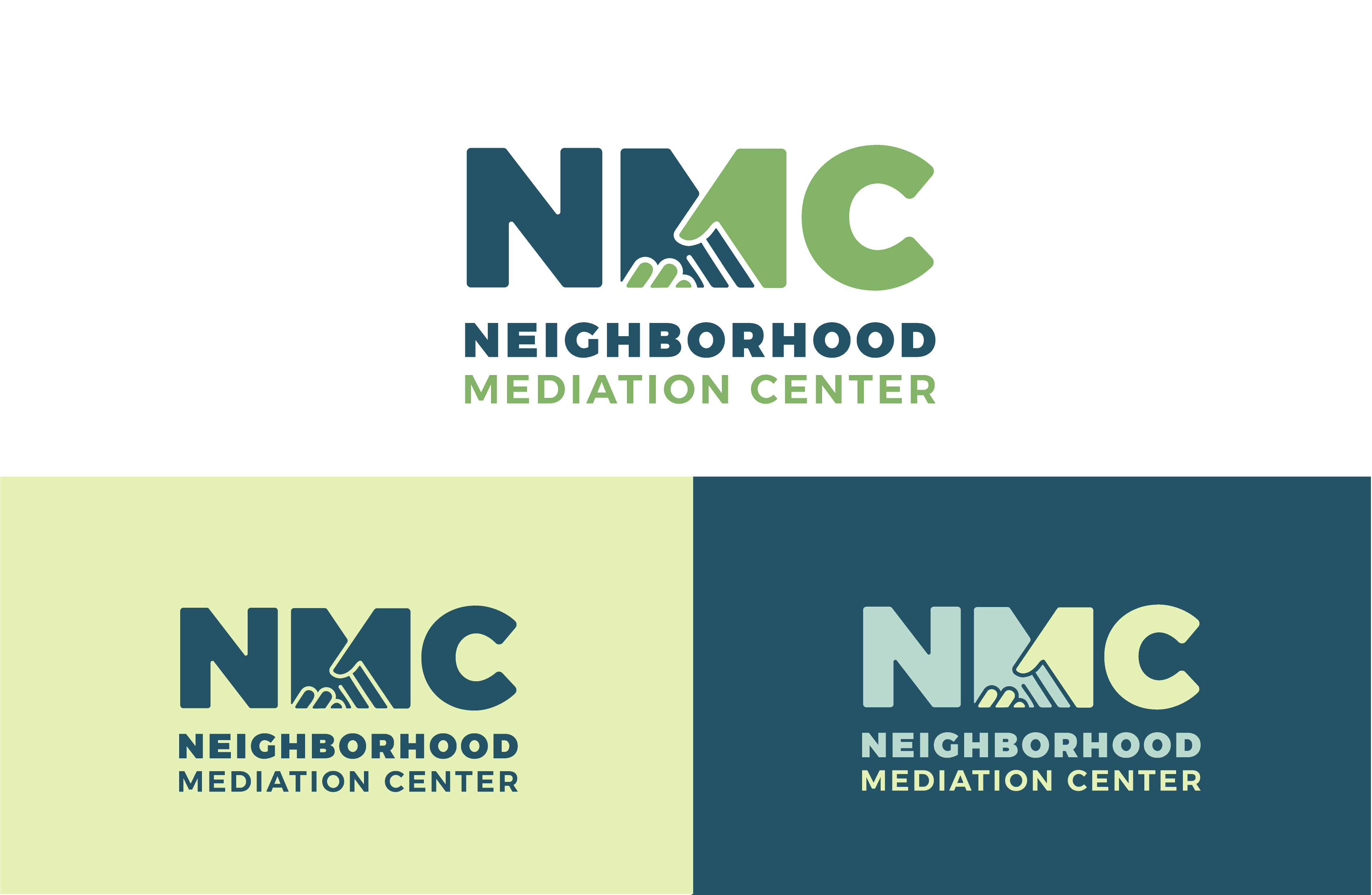
While the client liked their existing logo and felt attached to it, they understood it needed to be updated to feel more contemporary. We explored many approaches to this refresh to visually express coming together or agreement — some more abstract than others. In the end, we stuck with shaking hands to represent peaceful conflict resolution.
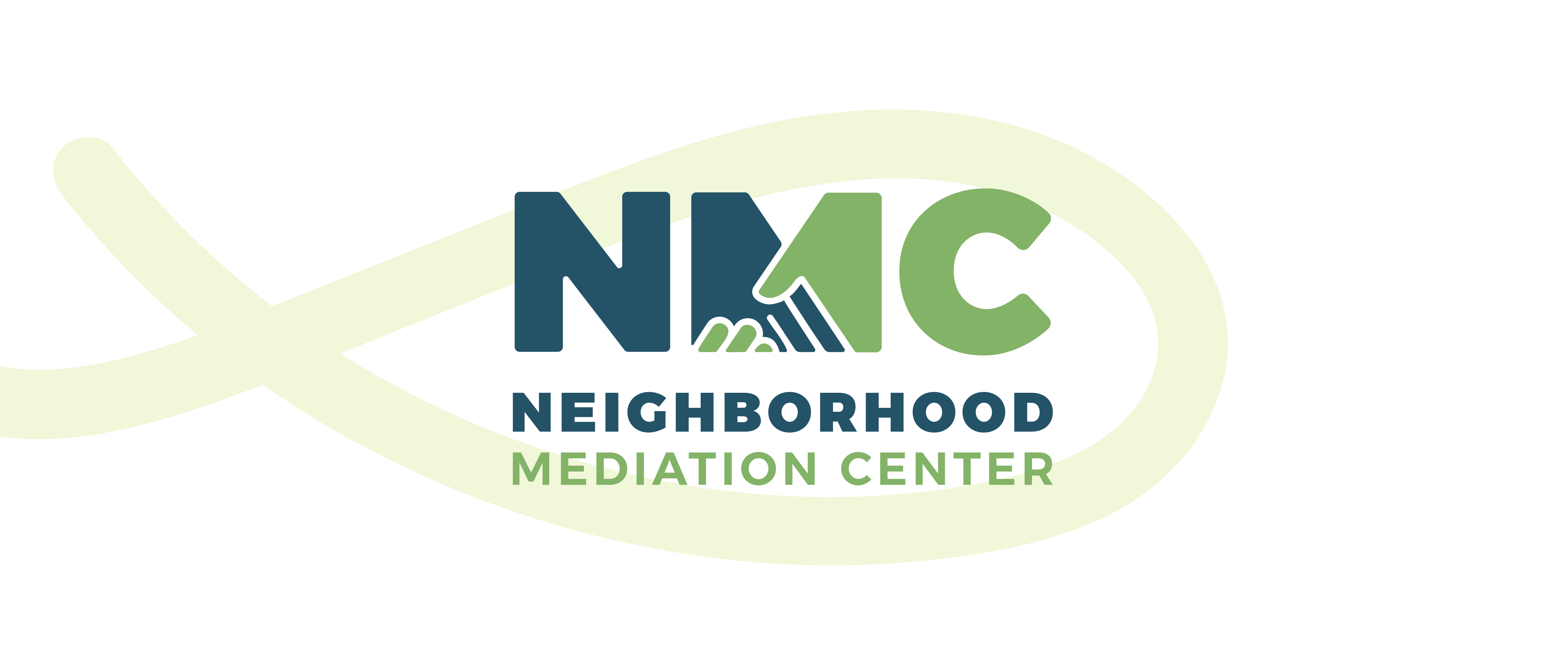
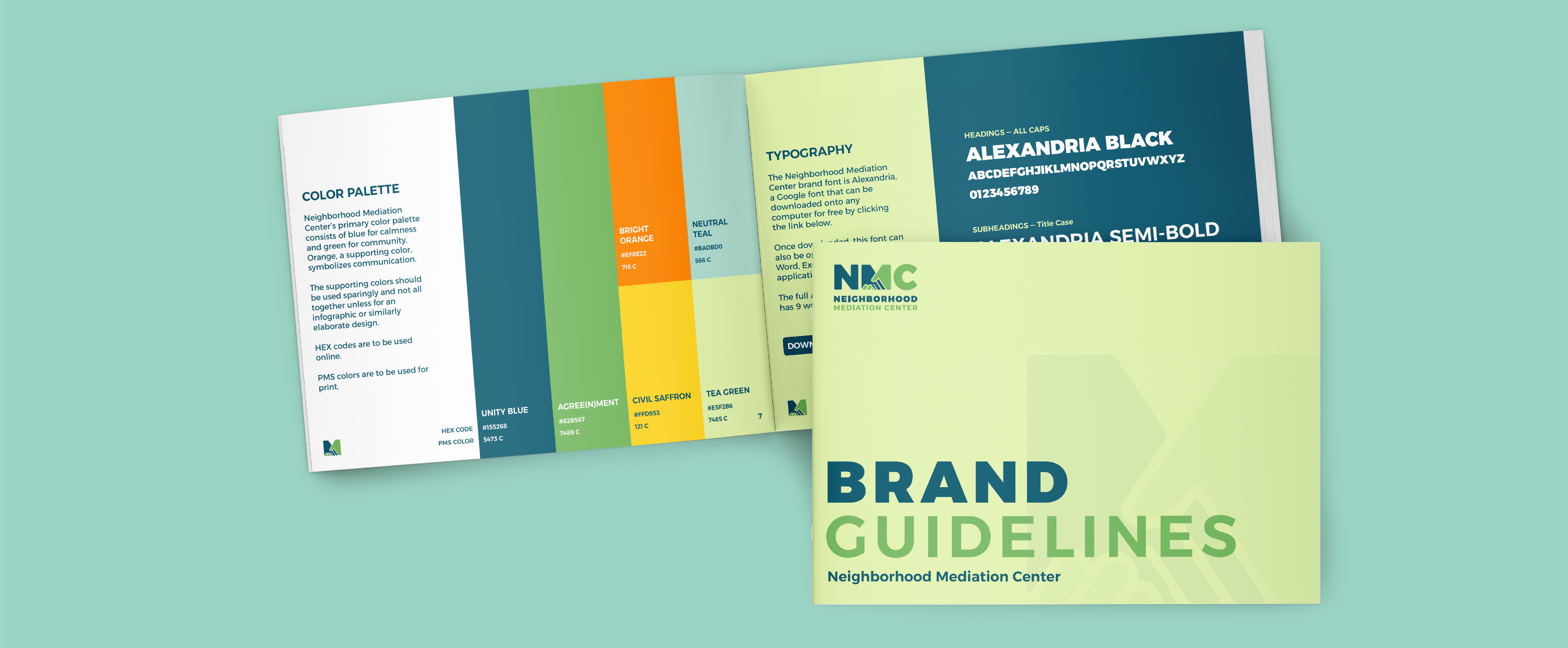
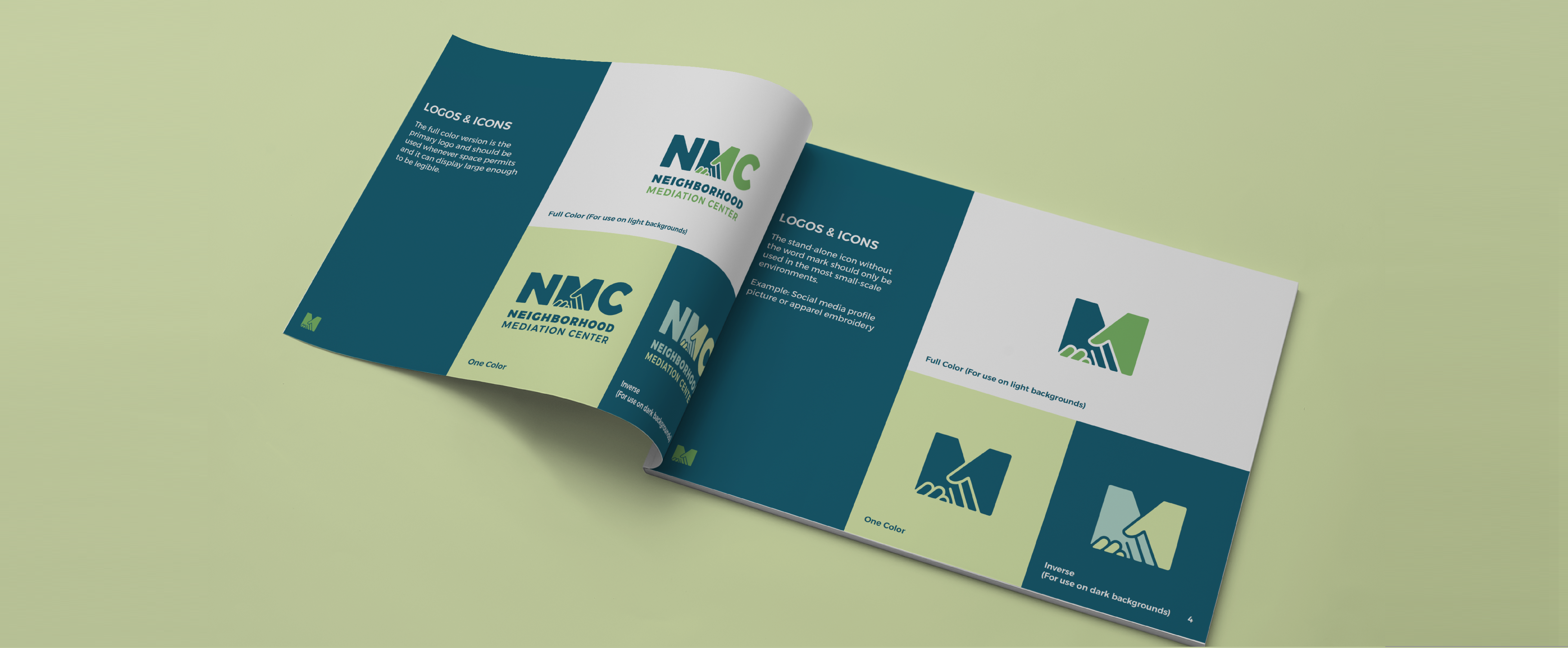
The new logo is more simplified, abstract and less cartoony, making it feel more sophisticated. Its green and blue tones are soothing colors evoking positivity, harmony, growth, safety and success. While this logo clearly evokes the previous logo, it feels fresh and new.